
Hey guys, today we are going to learn how to create profile card in HTML and CSS. Profile cards are a popular way to display information about individuals on websites, especially in team sections or user profiles. These cards are not only functional but can also be designed to look aesthetically pleasing.
In this article, we will guide you through the process of creating a simple and attractive profile card using HTML and CSS. While we won’t provide the actual code, we will discuss the key steps and concepts involved.
Before diving into the coding details, it’s essential to understand the structure of a profile card. A typical profile card includes a few key elements:
How to Create Profile Card in HTML and CSS
If you want to learn how to make a responsive profile card in HTML and CSS you can watch the video tutorial. Inside the video, you can learn everything from scratch. I hope you will learn many new things from this tutorial.
I hope you’ve watched the complete tutorial and learned many new things from this tutorial, I’ve shred the source code of the project on below you can check it now.
- Profile Image: This is usually a picture of the person or user whose profile is being displayed.
- Name and Title: The individual’s name and their title or role.
- Contact Information: This can include an email address, phone number, or other relevant contact details.
- Social Media Links: Links to the person’s social media profiles, such as LinkedIn, Twitter, or GitHub.
- A Brief Bio: A short description of the person or user, highlighting their skills or expertise.
You May Also Like:
- How to Make Responsive Table in HTML CSS
- How to Create An Admin Dashboard in HTML and CSS
- Travel and Tourism Website Using HTML and CSS
- Responsive Footer Design Using HTML and CSS
- How to Make Progress Bar in HTML and CSS
Creating the HTML Structure
To build your profile card, you need to create an HTML structure that incorporates the elements mentioned above. Use appropriate HTML tags, such as <div>, <img>, <h1>, <p>, and <a>, to create the necessary structure. Make sure to use semantic HTML for better accessibility and SEO.
<!DOCTYPE html>
<html lang="en">
<head>
<meta charset="UTF-8" />
<meta http-equiv="X-UA-Compatible" content="IE=edge" />
<meta name="viewport" content="width=device-width, initial-scale=1.0" />
<link rel="stylesheet" href="css/style.css" />
<link rel="stylesheet" href="https://cdnjs.cloudflare.com/ajax/libs/font-awesome/6.2.1/css/all.min.css" />
<title>Responsive Profile Cards</title>
</head>
<body>
<div class="container">
<div class="card_container">
<div class="card_data">
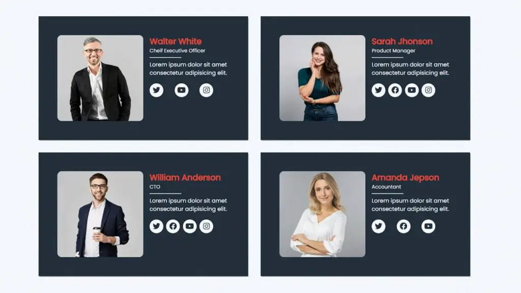
<img src="./img/team-1.jpg" alt="" />
<div class="pro_content">
<h2>Walter White</h2>
<p class="position">Chief Executive Officer</p>
<p>Explicabo voluptatem mollitia et repellat qui dolorum quasi</p>
<div class="social_icons">
<span><i class="fa fa-brands fa-twitter"></i></span>
<span><i class="fa fa-brands fa-facebook"></i></span>
<span><i class="fa fa-brands fa-youtube"></i></span>
<span><i class="fa fa-brands fa-instagram"></i></span>
</div>
</div>
</div>
<div class="card_data">
<img src="./img/team-2.jpg" alt="" />
<div class="pro_content">
<h2>Sarah Jhonson</h2>
<p class="position">Product Manager</p>
<p>Explicabo voluptatem mollitia et repellat qui dolorum quasi</p>
<div class="social_icons">
<span><i class="fa fa-brands fa-twitter"></i></span>
<span><i class="fa fa-brands fa-facebook"></i></span>
<span><i class="fa fa-brands fa-youtube"></i></span>
<span><i class="fa fa-brands fa-instagram"></i></span>
</div>
</div>
</div>
<div class="card_data">
<img src="./img/team-3.jpg" alt="" />
<div class="pro_content">
<h2>William Anderson</h2>
<p class="position">CTO</p>
<p>Explicabo voluptatem mollitia et repellat qui dolorum quasi</p>
<div class="social_icons">
<span><i class="fa fa-brands fa-twitter"></i></span>
<span><i class="fa fa-brands fa-facebook"></i></span>
<span><i class="fa fa-brands fa-youtube"></i></span>
<span><i class="fa fa-brands fa-instagram"></i></span>
</div>
</div>
</div>
<div class="card_data">
<img src="./img/team-4.jpg" alt="" />
<div class="pro_content">
<h2>Amanda Jepson</h2>
<p class="position">Accountant</p>
<p>Explicabo voluptatem mollitia et repellat qui dolorum quasi</p>
<div class="social_icons">
<span><i class="fa fa-brands fa-twitter"></i></span>
<span><i class="fa fa-brands fa-facebook"></i></span>
<span><i class="fa fa-brands fa-youtube"></i></span>
<span><i class="fa fa-brands fa-instagram"></i></span>
</div>
</div>
</div>
</div>
</div>
</body>
</html>
Styling with CSS
Once the HTML structure is in place, you can use CSS (Cascading Style Sheets) to style your profile card. CSS allows you to control the layout, colors, fonts, and spacing of your card.
Here are some key CSS properties you can use to style your profile card:
background-color: Choose a background color for the card.border-radius: Create rounded corners for your card for a more modern look.box-shadow: Add a shadow to give your card depth and make it stand out.text-align: Align the text and elements within the card as desired.font-sizeandfont-family: Define the font size and type for text elements.color: Specify the color of text and icons.paddingandmargin: Adjust spacing within and around the card.display: Set the display property to control the layout, such as inline, block, or flex.text-decoration: Customize links, if included, with underlines or other styles.
@import url("https://fonts.googleapis.com/css2?family=Poppins&family=Roboto&display=swap");

* {
  margin: 0;
  padding: 0;
  box-sizing: border-box;
}

img {
  display: block;
  width: 100%;
}

body {
  background: #f3f5fa;
  display: flex;
  flex-direction: column;
  justify-content: center;
  align-items: center;
  height: 100vh;
  font-family: "poppins", sans-serif;
  color: #fff;
}

.container {
  max-width: 1100px;
  max-height: 100%;
  margin: 0 auto;
}

.card_container {
  display: grid;
  grid-template-columns: repeat(2, 1fr);
  width: 100%;
  grid-gap: 2rem;
  padding: 2rem 0;
  margin: 2rem 0;
}

.card_data {
  display: flex;
  background: #212f3d;
  padding: 2rem;
  box-shadow: 1px 2px 3px rgba(0, 0, 0, 0.6);
  transition: all 0.9s ease-in-out;
  border-radius: 10px;
}

.card_data:hover {
  transform: translateY(-10px);
}

.card_data img {
  border-radius: 05%;
  width: 50%;
  height: 100%;
}

.pro_content {
  padding-left: 1rem;
}

.pro_content h2 {
  font-size: 1.5rem;
  color: #e74c3c;
}

.position {
  font-size: 0.8rem;
  margin-bottom: 1rem;
  position: relative;
}

.position::after {
  content: "";
  background: #ccc;
  position: absolute;
  width: 40%;
  height: 2px;
  top: 25px;
  left: 0;
}

.pro_content p {
  font-size: 0.9rem;
}

.social_icons {
  display: flex;
  justify-content: space-between;
  padding: 1rem 0;
  width: 80%;
}

.social_icons span {
  background: #f3f5fa;
  width: 35px;
  height: 35px;
  border-radius: 50%;
}

.social_icons span i {
  font-size: 1.2rem;
  display: flex;
  justify-content: center;
  align-items: center;
  height: 100%;
  cursor: pointer;
  color: #212f3d;
  transition: all 0.5s;
}

.social_icons span i:hover {
  background: #212f3d;
  color: #fff;
  border-radius: 50%;
}

@media (max-width: 1100px) {
  .container {
    max-width: 980px;
    margin: 0 auto;
  }
}

@media (max-width: 962px) {
  .container {
    max-width: 650px;
    margin: 0 auto;
  }
  .card_container {
    display: grid;
    grid-template-columns: repeat(1, 1fr);
    grid-gap: 1rem;
  }
}
Remember to use CSS classes or IDs to target specific elements within your HTML structure and apply the styles accordingly.
Responsive Design
To ensure your profile card looks good on various devices and screen sizes, implement a responsive design. Use media queries in your CSS to adapt the layout and styles based on the viewport width. This will make your profile card user-friendly and visually appealing across different devices, from desktop computers to mobile phones.
Responsive Profile Card in HTML and CSS
I made another video tutorial on how to use HTML and CSS to create a responsive profile card, you can learn it from scratch. Inside they have different content and designs, I hope you like them.
Conclusion
Creating a profile card in HTML and CSS is a great way to showcase individuals on a website. By understanding the structure, using semantic HTML, and applying CSS for styling and responsiveness, you can design an eye-catching and functional profile card.
Be creative and make your profile cards unique while adhering to web design best practices for accessibility and usability. Remember, the devil is in the details, so pay attention to typography, colors, and spacing to make your profile cards truly stand out.


